Usability evaluation
A university user study comparing Apple Maps & Google Maps
Background
During an evaluation methods course at university, I was tasked with a group project to compare the usability of two similar systems to find the best features out of the both of them to move forward with.
We chose the mobile navigation apps Google maps and Apple maps and conducted user testing with 10 people, (5 for each system), and analyzed the results to come up with new design solutions.
Disclaimer: This project is an independent user experience (UX) analysis conducted for educational and portfolio purposes only. It is not affiliated with, endorsed by, or sponsored by Apple Inc. or Google LLC. All product names, logos, and screenshots are the property of their respective owners and are used here under fair use for the purpose of commentary and critique.
Process
We created five different scenarios for users to try during testing sessions of about 5-10 minutes. For example: “Find an ice cream shop in Los Angeles and give it a 4 star rating”.
We observed the participants during tests and asked them to fill out a background and SUS-form about their experience when finished. We counted how many tasks were fulfilled on each test as well as the time that it took the participants. This way, we could understand the satisfaction, effectiveness as well as efficiency of each system.
From our observations we noticed a few main design issues, mainly in Apple maps and created new design solutions to mitigate these problems.
End result
I made edits to screen shots of Apple maps interface using Figma to illustrate our recommendations for changes moving forward:
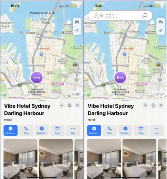
Our first design recommendation for Apple maps was to move the search bar to the top so that it is always visible, even when browsing an establishment or other location.
After
Before
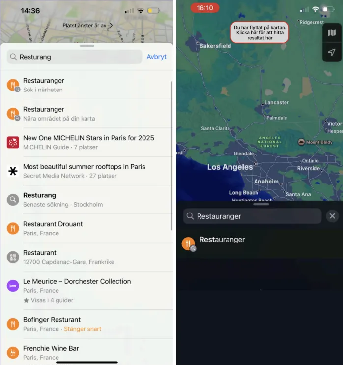
Our second design suggestions was to only show one kind of result for a given search in the search result, which would show near you. If you want to see results where you moved the map, you are able to press the button on the top of the screen.
After
Before
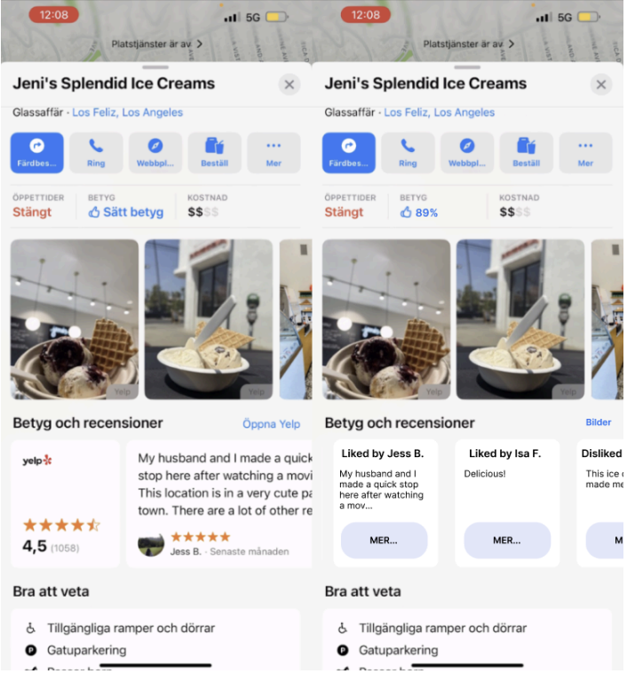
The third design suggestion we made was to simplify Apple maps ratings system to a single, same one throughout the app and not mix third party ratings with in-app ones.
After
Before